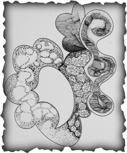
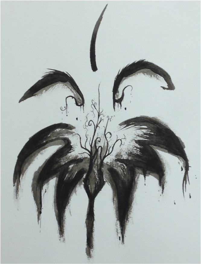
This was an experimental image, trying to develop my own style with in the rules that they gave. I wish I pushed harder and broke the rules to truly make this make this my own. For the areas that I feel that succeeded in that lust and goal I am truly in love with till this day.
Also the little darling in this pic is a little sheep named Sheepi
Random doodles in a personal sketch book made it into the final take.
|
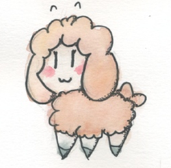
"Ish Sheepi"
~Sheepi |
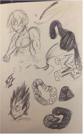
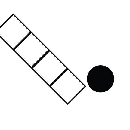
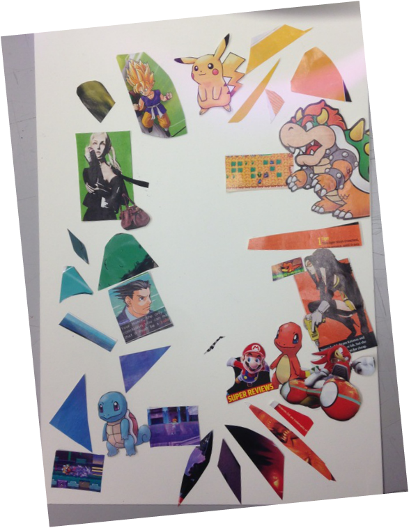
This was our next project – transforming one object to another. The one to the side is the beta sketches for this pice wile the others below it show the transformation in full effect. The final line work was traced from a number of the beta sketches that is to the side. I'm proud of the quality of this one.


This was the second leaf we had to make. Though this one did not get cut up in the end it's personally my favorite out of the two looking back. It would have been a pain to cut up this one however.
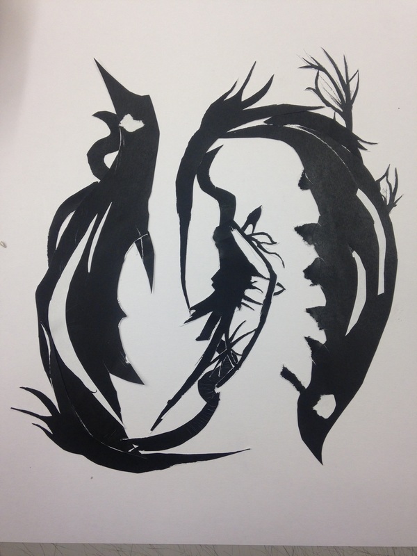
The leaf project was quite enjoyable to do. It was fun to. I loved working with ink so this one was not that much of a "scary" challenge. Though the remastering were we take parts of the leaf and change it was a challenge. It took a few risk cutting into the project itself and sadly it wasn't worth the gamble.

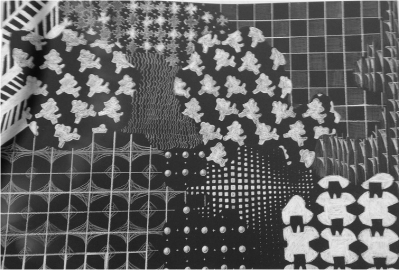
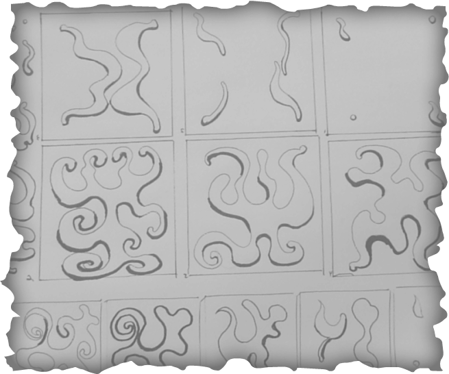
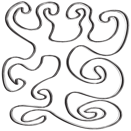
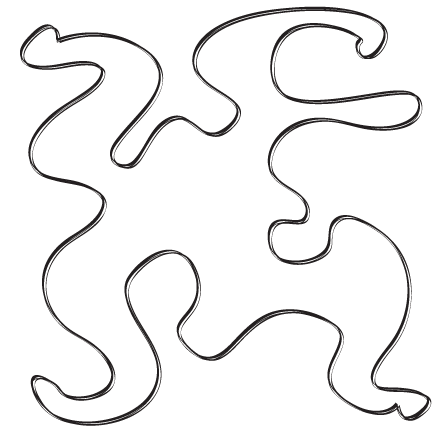
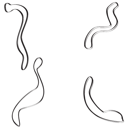
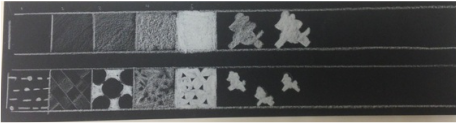
This project above was hell. I was hard press to make my own patterns by hand and not using the tracing technique. I didn't want to outride take someone else's patterns and use them as my own. Granted here or there I did use a few traced patterns but as a whole each pattern was made by my own eye. To my bigger surprise that none had it done on the due day but me. And I'm more surprise of the great i got. I guess the hard work payed off.
|
|
Little to no planning also was taken for the patterns project as well. A scribble here, a cut out here, but all in all it was one take only. I did it live baby but I regretted every second of it.
|
|
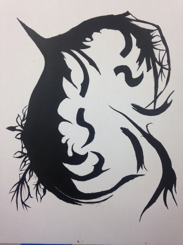
This little book was a pain. I'm not good at arts and crafts like this and trying to put a pretty bow on something already about to fall apart still barley holds it gather. Still though, I adore the the little covers I made for the booklet itself instead of the book as a whole~
|
Most of these photos were from the discontinued NintendoPower Magazines. Looking threw them again was like looking threw a 5 chapter long obituary and the first 4 and a half chapters were dedicated to that awkward teen phase that dead person's life.
It was a lot like looking at a mirror…
It was a lot like looking at a mirror…
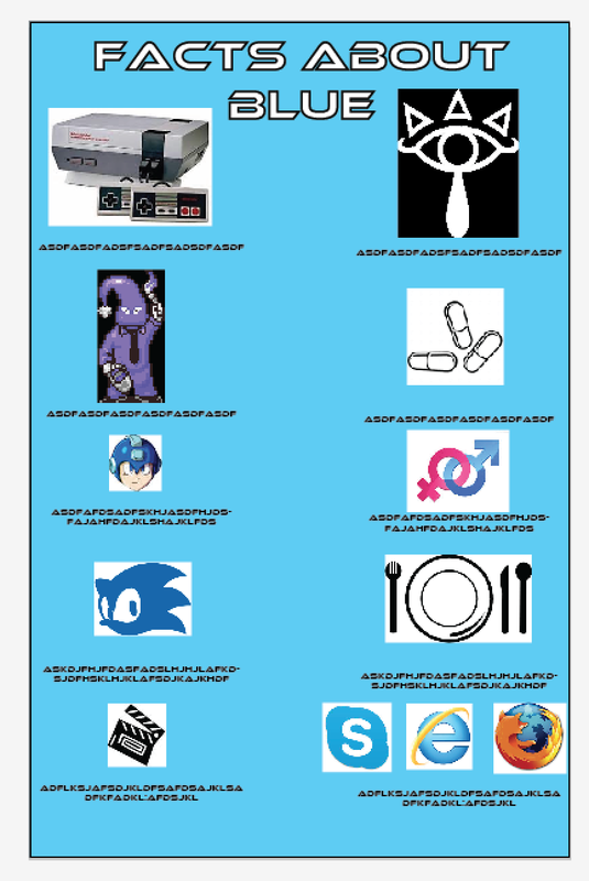
The one above and below this little bla of text is our color project. I was grateful for having the color blue instead of an disgusting color like yellow.... I'm happy that the end final project didn't look anything like the WIP.
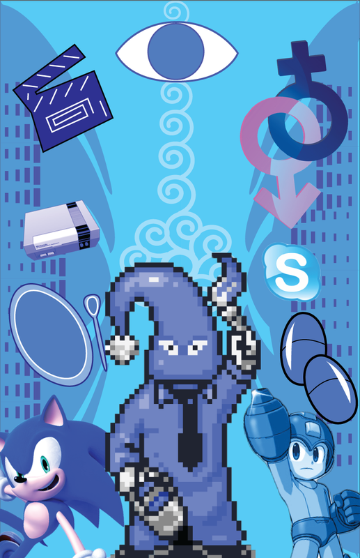
~And Now, Random Facts About Colors~
Orange is used with religion like in Buda
The original version of orange paint was highly toxic therefor hardly used
Violet is the color of creativity and in some cultures it stands for privilege and wealth
Purple holds meanings as well, however, depending on where you are in the world, Purple and Violet may represent different colors. In UK and USA Purple and Violet are used interchangeably. In France, Violet is more of a pinkish hue wile Purple is more of a blue hue of purple.
Pink is a color that over the years represented different genders from no preference, to male, to female, to now were its no preference again. However its more noteworthy to note that staring at the pink for too long will make you frustrated.
Green is a soothing color and is often shown to welcome growth. And its the most seen color in the world next to blue.
Grey is a color that is often to be depicted as boring, bland, but its a great color for mixing. It makes every color become pop out more.
Red is often represents power, lust, and is energizing to look at.
Yellow represents happiness, joy, and sunshine. All things I despise.
It is also a known fact that yellow is the most ugliest color, its practically common knowledge.
Blue is the best color, it is calm, cooling and the best color ever. It is so brilliant that blue eyes are not even blue, but transparent, thus blue light just reflects off of it.

|
|
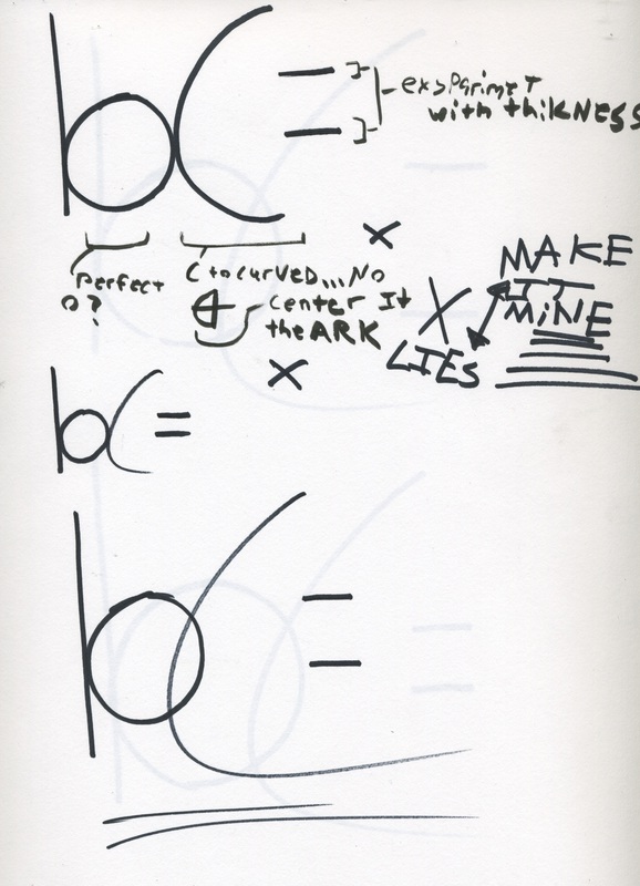
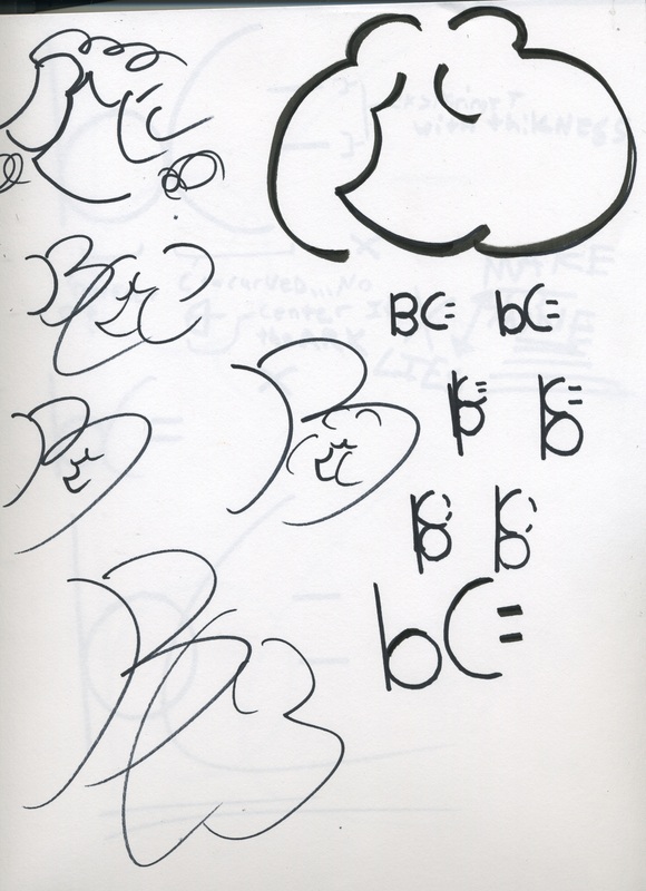
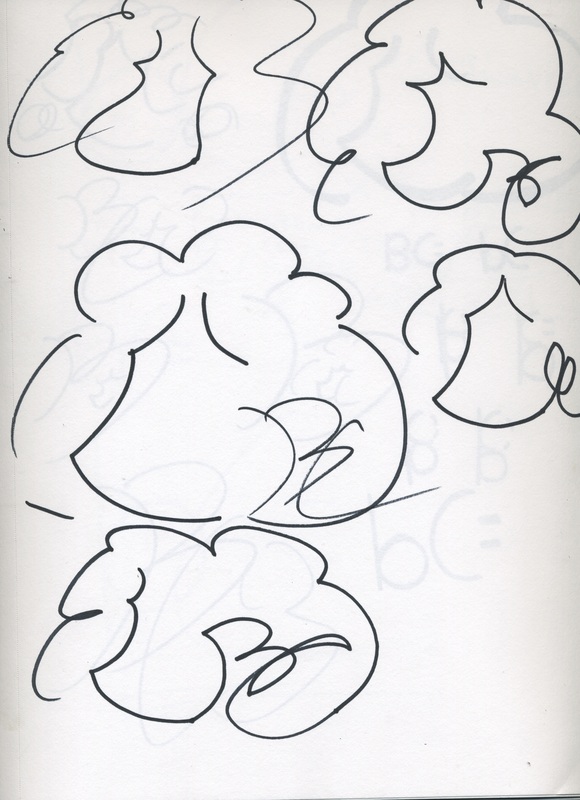
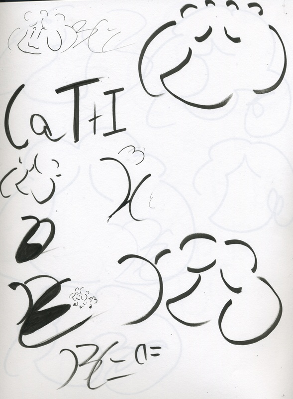
Dispute the similarity before, this is in-fact not Sheepi's head but. This is instead my head. Though honestly with everyone i showed it mistaking it FOR Sheepi, i should just say it's her and roll with it. Anyways, I always wanted to have a small drawing included in my signature but I quickly learned that its much more effective to just have the "BC;" It was nice to finally incorporate my persona in my mark.
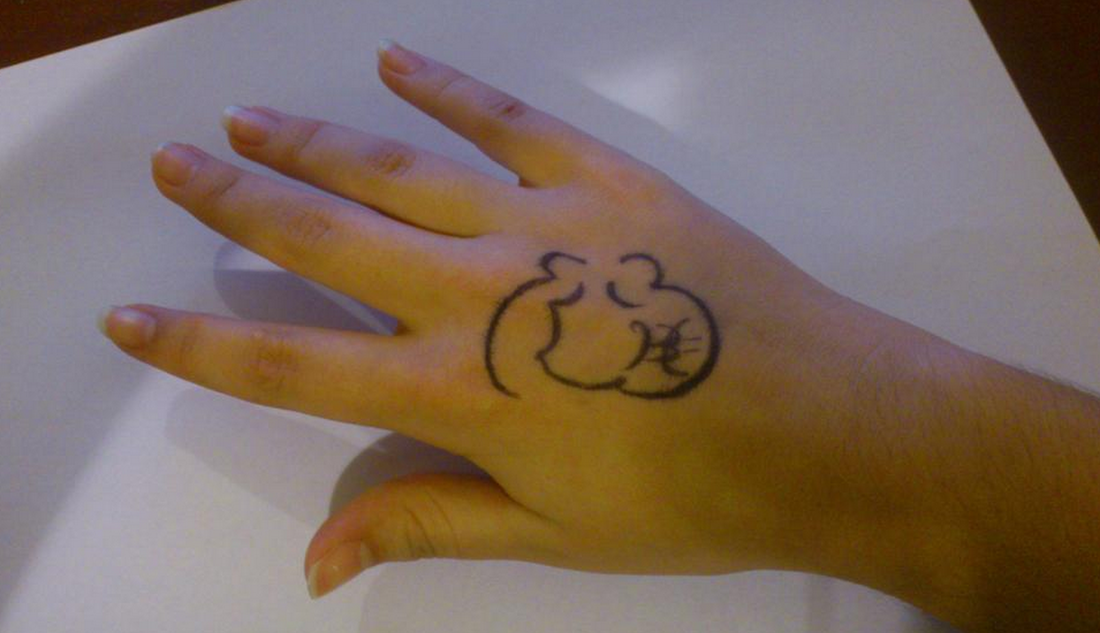
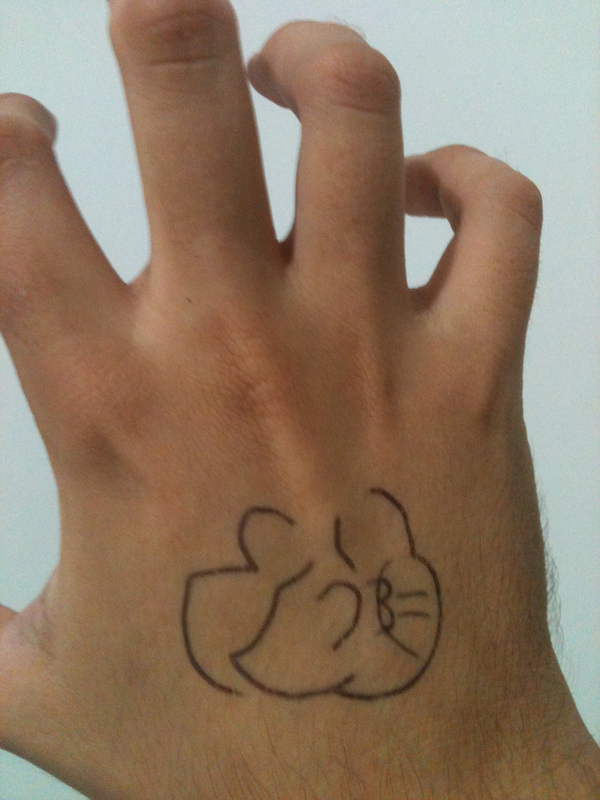
Friends from from Spain and other from Brazil marked their hands for me. More online friends marked their hands too but they had big harry hands and you couldn't see the marker at all. Sorry fellas.
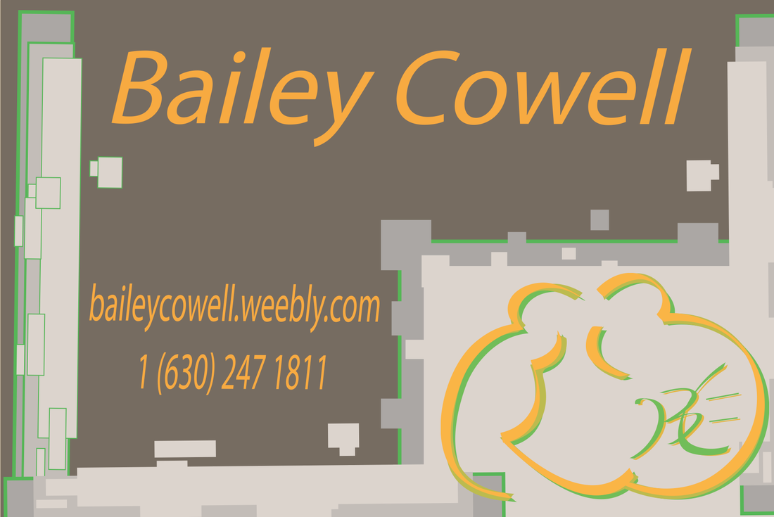
Why the hell did I pick brown? This is more of an gardener's card than a artist.
Yes I was the one who put the duck tape there
BUT IT WAS IN THE NAME OF ART!!! also i couldn't feel my legs after that one
BUT IT WAS IN THE NAME OF ART!!! also i couldn't feel my legs after that one
Base Box That I used
Box in work in progress stages
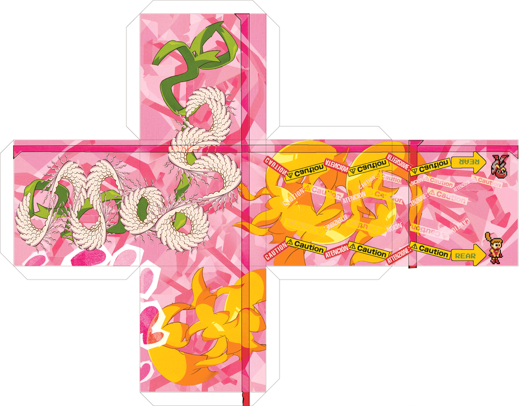
The box project was much more in the realm of my forteo. Making the design wasn't the hard part though in the end, what was however was finding quality paper and making into the box was the hard part. In the end I used reflective paper reinforced with thick paper, I forgot the tentacle terms for them but basically its a sticker on thicker paper. I wanted to use canvas paper but that wouldn't be good with folding. All in all I'm happy how this one turned out.
Attempts were made to put it in a 3D program during the development process. I have ZERO experience however in 3D programing or just art in general so just learning how to use this program took about as much time as it would just making the whole thing by scratch. It was worth it though since I didn't need to print mock up after mock up trying to see if it folded right.
